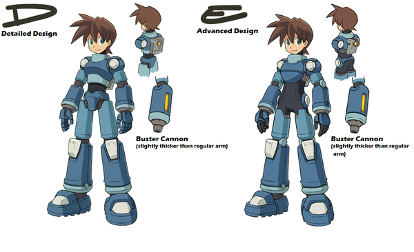
The long-awaited results of our Mega Man Suit Design Vote (Decisive Round) are in! In our “decisive round”, we presented to above two design candidates, and you guys made your opinions heard loud and clear. Check after the jump for the results, the new design, and extensive notes from Art Director Ishihara-san.
Japan:
1st Place – Design D (66%)
2nd Place – Design E (34%)
US:
1st Place – Design D (43%)
2nd Place – Design E (57%)
After presenting a total of five original design drafts, we’ve solidified the direction we want to take with the final design. Check it out.
Original five:
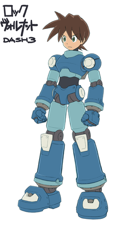
New Design:
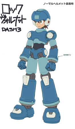
New Design With Helmet:
New Design from Rear:
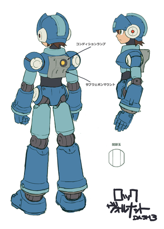
Note the condition indicator and special weapon mount built into his backpack.
Pretty cool, right?! Let us know what you think in the comments!
And now, as usual, some notes from Art Director Ishihara-san.
======================================
 Thanks for all the votes on this! In both Japan and the US, Design D rated higher than E. Guess that means I should base the final design on D. The “newness” I tried to show with Design E will be shown with Barrett, and I’ll aim to preserve MegaMan’s look from the previous titles while still making him seem a bit cooler than before, if only on a subconscious level.
As a result, I’m currently planning to change Barrett’s design in a big way!
Anyhoo, I was feeling very ambivalent for a bit there, but with the pressure of deadlines as my aid, I was able to come up with something that seemed just right, and the Director even signed off on it.
We’ve got more than 10,000 members in the Devroom(s) right now, but it’s a rare experience indeed for me to receive so much specific feedback from so many people. Of course, I didn’t try to incorporate each and every single comment, but I went through them and digested them and took what was useful, and along with the Director’s often strange orders (“He looks like a seventies cartoon cop so change it”), finally came up with a completed version. The key was to never forget about what was really important to this design. It was a big challenge, but very interesting, to be sure.
Below, I’ve given explanations for each aspect of the design. It’s very long and involved, so just have a look if you’re interested in that kind of stuff.
Colors
I guess I toned down the colors a bit too much with the last vote, so in this design I’ve brought back some of the vibrance in a way that won’t be too garish, whether onscreen or in illustrations. Of course I’ll apply similar adjustments to Roll and the others as well.
Visage
By upping his height slightly, shrinking his eyes a bit, and applying a few other little adjustments, I’ve upped the sense of “gallantry” or masculinity in his visage. His shoulders are also broader than before. I’ve also thinned his outline, making him look a bit “crisper”. This isn’t directly related to his design, per se, but we mustn’t forget the importance of presentation as well.
Pants
I went with the undies! In the end they felt essential for achieving that overall “mecha” feel. Taking care to maintain the overall balance of detail, I did my best to make the pants look as cool as possible. I imagine that the circular attachments on his left and right would move depending on how he moves his legs. I guess I still have to think about how they’re attached and such, but right now I’m more concerned with the look of the design than with total realism.
A number of folks out there factored the possibility of this design being made into an action figure when they posted their comments, but that really is more of a secondary concern. If they should make a figure of this design somewhere down the line and mobility should be an important aspect of that figure, I believe those in charge of making the figure would come up with a good solution. I hope, anyway.
Joints
Rather than hide the joints, I’ve made them bigger, putting the mech-like aspects of this design at the forefront. I have made them all dark gray though, so as not to be too bothersome to the eye.
Hair
In the old design, MegaMan had a set number of defined spikes emerging from his front hair–three on the left, three on the right. For the new design, I decided not to stick to any one number, so as to make the hair look less “habit-prone”. I guess you could say “habit” is just another word for “characteristic”, but in this design I’ve tried not to change it too much, but rather just make his hair look generally messy as opposed to spiky in a defined way. If you noticed this, you’re pretty darn sharp.
Backpack
The backpack that appeared in Legends 2 was intended to provided a much-needed accent as well as symbolize MegaMan’s role as a Digger (the reality of how little it could carry was ignored). For the new design, I consulted our planners and decided to have the backpack work as a signal to show you MegaMan’s life and any status effects. I also added in a mount for special weapons. It might be annoying if you have any really big weapons attached to that thing though. . . .
=============================
Very interestingggg. . . . Personally, I really dig this new design. What do you folks think?


 Thanks for all the votes on this! In both Japan and the US, Design D rated higher than E. Guess that means I should base the final design on D. The “newness” I tried to show with Design E will be shown with Barrett, and I’ll aim to preserve MegaMan’s look from the previous titles while still making him seem a bit cooler than before, if only on a subconscious level.