Falling in love with Remember Me – Love at Every Sight
Jul 06, 2013 // GregaMan
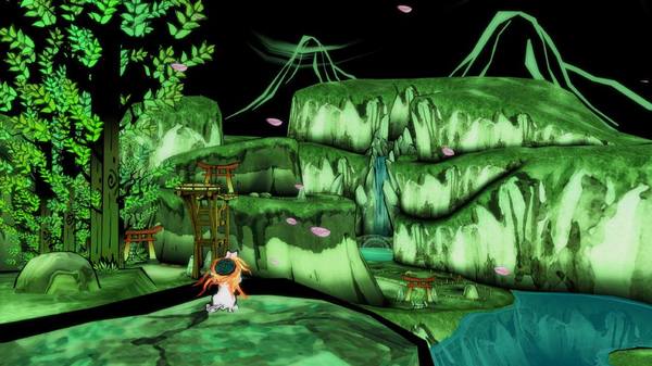
As I previously mentioned in the first of this series , I wasn’t “assigned” Remember Me for work, so I was pretty late to the party by Capcom internal standards, only getting to play through it a couple weeks after it launched. But that’s why I’ve felt so compelled to do this series–because I wasn’t asked to. So! What game has your favorite art? For that matter, what role does art really play in a game, and what impact can it have on the player’s experience as a whole? Think about it for a sec. Do you guys remember Okami? If you’ve never played it, go ahead and close your browser right now, fire up the PSN Store, and download Okami HD. We can talk about this later. You monster. I think everyone else will agree that Okami’s unconventional art style, which emulated the minimalist brushlines of old-timey Japanese ink paintings, elevated what was already an excellent contribution to the admittedly very crowded action-adventure genre to something whose significance transcended genre altogether. Okami in its earliest stages of planning could have turned into something that left players saying, “Well, that was fun and neat.” But instead it left us saying “That was the game that made me realize video game art was a thing.” Although, the reality is that thoughtful, meaningful game art has been a thing for about as long as games have, as illustrated by the Smithsonian’s recent exhibit and book , The Art of Video Games. There’s even a case to make for text-only games like Zork using a lack of visual aid to make a point. If you think that’s a stretch, consider the technical limitations that have inspired art and creativity throughout gaming history. In the following clip from Rockman Unity’s legendary interview with Mega Man 2 creator Naoya “TOM-PON” Tomita, Tomita professes that one of his proudest artistic achievements from Mega Man 2 was not the Mecha Dragon (even though he did design it), but the blocks Mega Man stands on during the encounter. Why? Because he was limited to the use of a single color of pixel to create something with depth, texture, and shadow–an artistic challenge overcome.
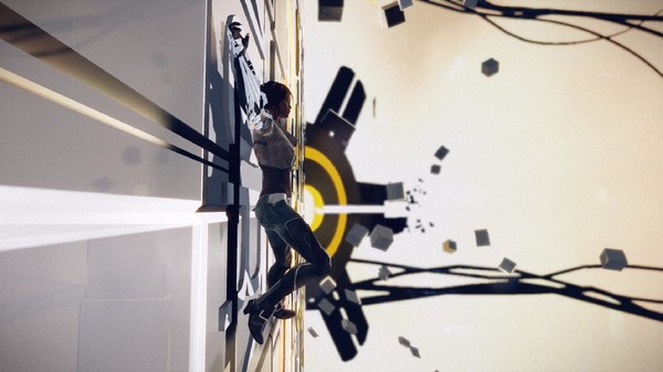
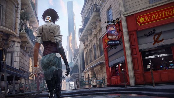
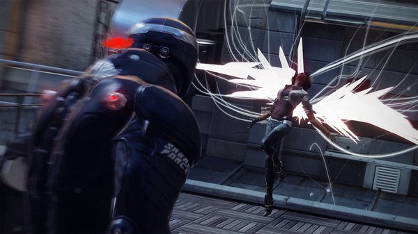
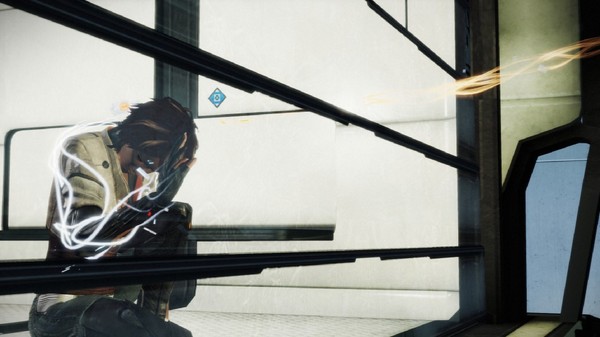
The clever economy of symbolic animations and abstract shapes is what granted a unique visual flare to the likes of Monster Hunter and yes, Mega Man Legends. The Data dance, anyone? It’s just oscillating balls! Indeed, that legendary Okami art style was in itself a clever ploy to get more bang out of fewer polygons and thereby facilitate a game that was, as I wished they’d worded on press releases, friggin’ gimongous. Obviously the types of technical restrictions faced by modern games are a far cry from those of Mega Man 2 or Okami, but what we’ve ended up with is a generation where games are no longer required to be symbolic or economical to convey something elaborate. The plus side of this is that games can show all sorts of crazy crap and detail and realism and what-have-you. The trade-off, however, is that we also get tons of games that are content to present a very literal, drab, and yeah I’ll just come out and say it–brown manifestation of things. I think Capcom fans can take pride that Capcom has remained pretty gosh-darn vibrant in the face of this shift. And usually when our games are brown, it’s to make a point. Dragon’s Dogma may be the most visually understated game ever to feature a floating eyeball of death. But it bears stressing how far over the bar Remember Me has vaulted with its art direction and visual design. I guess it’d be a little unbecoming (or unconvincing) of me to just rattle off subjective praise for a game published by my own employer, but as a bit of anecdotal evidence, let’s just say I knew this game was something special when I stopped playing for a moment to take a photo of a sewer. Not my finest photography, but quite possibly gaming’s finest sewer. Each and every moment of this game, even the ones where you’re in a sewer, had me gushing, gleaming, gawking over its visual perfection. The most poignant appeal I can make to you Unity folks is that this is the first game that has made me feel this way since Okami. Never else have I been so thoroughly and consistently captivated by the look of a game. Every artistic decision serves the game’s overarching identity, from the photorealistic billboard ads and “augmented reality” enhancements that clutter the cityscape, to the subtlest flip of Nilin’s hair. Ultimately we’re presented something refreshingly vibrant and unbrown, considering the bleakness of life in Neo-Paris and the game’s kinship with works like 1984. The lighter side of Neo-Paris. And talking as I was of technical limitations, Remember Me fully benefits from being timed this late in the life cycle of current hardware (more to come in future posts on why this game had to be made now) ; few games are simultaneously both this visually ambitious and this comfortably aware of their hardware specs. Anyway. Just another testimony on how I fell in love with this game. Take it for what you will–I’m pleading guilty in any case. But I do have utmost faith that this is a game that will speak to many here on Unity. It’s got this color –this uncompromising autonomy; a life of its own–that I believe is at the core of Capcom lovers’ fandom. Notes: -If you fancy yourself music savvy, don’t forget to take part in our Remember Me Remix Contest , going on now. The winner will receive a big ol’ heap of awesome stuff.
↑ Okami before and after the advent of “art.” 
Capcom braves the modern age with flying colors. 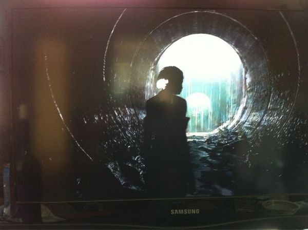
-If you do fall in love with Remember Me’s art, Dark Horse has published a very snazzy art book with lots of insights from the game’s creators.
-
Brands: Remember MeTags:
-

Loading...
Platforms:
