Phoenix Wright: Ace Attorney – Dual Destinies Localization: Secrets of Character Design Revealed
Sep 26, 2013 // Janet Hsu
An inside look at the Phoenix Wright’s transition to 3D and the creation of Athena Cykes and Simon Blackquill
Hi everyone! Janet Hsu here from Capcom Japan! I’m the Localization Director for Phoenix Wright: Ace Attorney – Dual Destinies , though I’m hardly new to the series as my involvement as the localization lead/lead translator these past 8 years and 5 (including this one) AA games can attest to. As some of you may already know, in our effort to work closer with the dev team as they were making the game, we integrated AA: DD’s localization into the overall dev process. The result is a level of behind-the-scenes access we’ve never had before, enabling us to faithfully preserve the intentions of the Japanese version while bringing you the localized world of Ace Attorney you know and (hopefully) love.
With that in mind, I’d like to take the next few weeks to share a few of those behind-the-scenes tidbits as we count down to AA: DD’s release on October 24th! So, without further ado, here is the Art Director, Mr. Takuro Fuse, to explain how he and his team created the wonderful character designs and models for this game.
Hello, my name is Takuro Fuse, and I’m the Art Director for Phoenix Wright: Ace Attorney – Dual Destinies. Nice to meet everyone. Today, I’d like to share how my team and I re-imagined and adapted the iconic Ace Attorney aesthetics for the Nintendo 3DS, as well as the thought process I went through while designing Athena Cykes and Simon Blackquill.
Now, I’m sure some of you are wondering just who the heck I am, so just to give you an idea of what I’ve worked on, my past projects include Ghost Trick: Phantom Detective, Gyakuten Kenji 2 (Ace Attorney Investigations 2), and even Ultimate Marvel vs. Capcom 3. That’s right; I was involved in the creation of Phoenix Wright in UMvC3, so I guess you could call it fate that I was called to work on AA: DD. But enough about me, you’re here to hear about AA: DD, right?
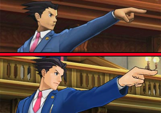
The first order of business my team and I had to tackle was how were we going to create polygon models that unmistakably looked and felt like the series’ iconic 2D sprites? And of course they had to preserve that feel even when they were viewed in full 3D. Well, a few of the artists and modelers on the team got together and put together a concept trailer for this game’s visuals, and this was the result of their first foray into creating Phoenix Wright in 3D.
As fond of a memory as this brings back, it also makes me cringe…
But! As cringe-worthy as this may be now, we wouldn’t have the in-game models we have today if it wasn’t for this initial prototype. With the help of everyone on the dev team, we continued to refine the way Phoenix’s 3D model looked based on feedback we received until everyone was satisfied.
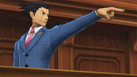
Obviously, the models themselves aren’t the only things we strove to preserve; there was the matter of how to keep the lively animations from the 2D sprites. However, this was also the Nintendo 3DS, so we wanted to include some elements that took advantage of the new hardware. Thus, by adding in some slick camera work and connecting motions that gave the 3D models that extra bit of fluidity in their movements, we were able to bring a new, hybrid Phoenix to life.
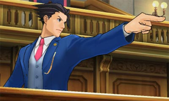
I hope when you get the chance to play the game that you’ll play it with the 3D volume all the way up. Nothing would make me happier than to have you experience it in all its glory!
Shifting gears now, let’s talk character design. We’ll start with our new heroine Athena Cykes and then move on to our new rival prosecutor Simon Blackquill.
Athena is the new “sidekick”, but she isn’t just there to assist Phoenix and Apollo – she is also a strong-willed defense attorney herself who is determined to prove that she can hold her own in a court of law. Designing a character in such a unique position proved to be quite difficult, as I struggled with it day in and day out. At one point, Athena’s silhouette even looked something like this
.
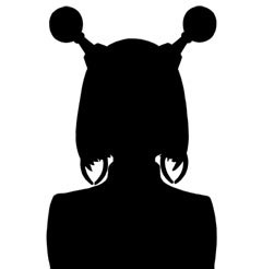
The fact that this messed up design had even been a serious contender shows just how messed MY head had become, but in the end, the Athena you know is the design we settled on.
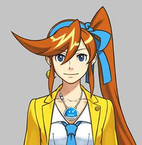
When she’s playing the role of the assistant in court, I knew that Athena would be standing to Phoenix or Apollo’s left. Taking that into consideration, I felt that this hairstyle was the best-suited, not just because it looked good from the player character’s viewpoint, but because it’s great at conveying Athena’s enthusiasm and energy when it moves. As for why her bangs end in a giant spike, that’s because she took a look at her boss and Apollo’s haircuts and decided that she would need to make her hair spiky too somehow if she wanted to fit in at the Wright Anything Agency… Just kidding.
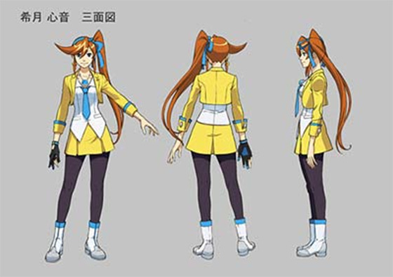
A front, back, side drawing that served as the basis for our 3D models and anime character designs
Next, I’ll talk about the little gadget that literally hangs out around Athena’s neck.
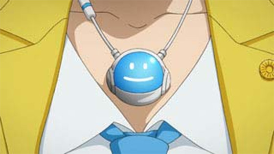
This little guy named Widget came about as a way to visually represent the Mood Matrix, which itself is a tool Athena uses to perform psychological analyses. Because we wanted other characters to also be able to see the Mood Matrix program, it was quickly decided that Widget would have the ability to project a holographic image. But how does one go about creating a visual representation of the wholly mental? That proved to be a tough question to answer, but we found an answer in the vastness of space and here on Earth – a portable planetarium of sorts became the base motif around which the Mood Matrix was built.
By the way, you’ll notice I said that the Mood Matrix is a program. That’s because when Athena’s not running it, she can use Widget to browse documents and other pertinent information.

The four smileys you see in the Mood Matrix and throughout the game were designed to make the basics of analytical psychology easy to comprehend by breaking the range of human emotions down into four main categories.

In the end, the visuals and background music for the Mood Matrix retained a lot of that outer space feel. Now that you know that, I wonder if you’ll find it that much more interesting when you play these segments?
That about wraps it up for Athena, so let’s move on to our new rival prosecutor: Simon Blackquill.
In the Ace Attorney series, the character that fills the role of rival prosecutor is as important as the characters of the defense, but Blackquill is anything but your average prosecutor – he is also a convicted felon who is currently serving time. When I first heard this contradiction-laden back story, I wanted to berate the scenario director Mr. Yamazaki for coming up with such an outrageous character, and yet, I couldn’t help but think about how strong of an impression the concept of a “convict prosecutor” had left on me either. So I sat down to design him, feeling quite contradiction-laden myself.
My initial idea was to make him unlike any prosecutor this series had seen before, so I approached his design almost solely from the convict angle, the results of which were… well…
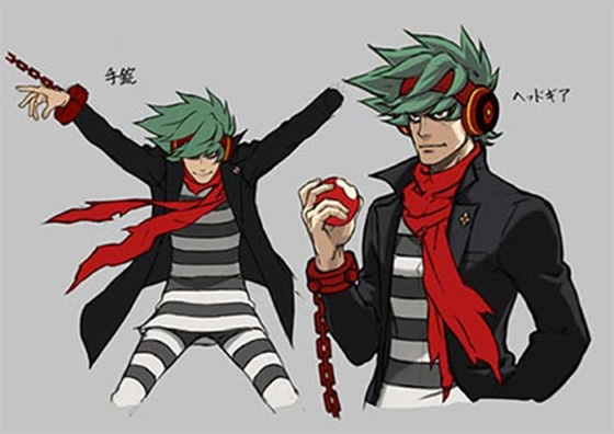
He looks like a total criminal
At the time when I came up with this design, it was Blackquill, not Athena, who had the special ability to discern people’s true emotions from their voices; thus, the headgear in his design.
For my next attempt, I tried to put less “prisoner” and more “prosecutor” into his design, but I incorporated so many prosecutorial design elements into it that he became just another prosecutor to me. Because criminals and prosecutors are natural opposites, when I increased the essence of one, the other retreated into the folds of the design. It was like trying to stand in the middle of a see-saw that was impossible to balance.
“This is bad,” I thought to myself as I tried yet again to think of a way to synthesize the two aspects of Blackquill into one. Staring at the stripes on his prisoner’s uniform, it hit me – this black and white color pallet… it reminded me of the Akouroushi * of “ChÅ«shingura” fame… “Yes! This is it!” I thought. The idea I had hit on was to incorporate elements of Japanese traditional clothing, which would prove to be the key to my dilemma!
*known in the West as the “Forty-Seven Ronin”, whose clothes were colored black and white
Of course, just because I had the key didn’t mean I had automatically unlocked the secret to Blackquill’s final design. After all, if I made his outfit too Japanese, he would no longer look like an Ace Attorney prosecutor. Furthermore, convict or no, Japan also has the Firearm and Sword Possession Control Law (which in broad terms forbids the general public from possessing firearms and swords). If I let Blackquill run around with a real katana, no one would know what the heck to make of him, because how in the world would a convict be allowed to carry a sword around when the average citizen would be arrested for doing that! Still, there was an answer to be found at the junction of the black and white Japanese and prosecutorial Western styles of clothes, and that was the Westernization of Japan during the Meiji era (1868 – 1912)! I was one giant leap closer to the Blackquill we all know today.
I went through a bunch of designs after that, but the one fact I could not ignore was that he was to be an Ace Attorney prosecutor, and as such, he would need to look sharp and stylish in Western clothing. That’s why, in the end, we went with his shackles as the sole object that directly symbolizes his criminal status. His one “unprofessional” trait, the messy pony tail, also serves to bring out the feeling of a long incarceration, as well as reinforce the rÅnin image in his design.
I originally wanted to give Blackquill his partner hawk Taka simply as a way to extend the Japanese elements of his design by lending him the aura of a traditional Japanese falconer * , which are just plain cool. But the more I thought about it, the more it made sense to give him a partner who could help him out by bringing documents and evidence to the prosecutor’s bench – it would serve to highlight how limited Blackquill’s movements were, being shackled and all. Thus, Blackquill’s “bosom buzzard” was born. Yeah, so it had nothing to do with the fact that I like birds… Nope, none at all…
*Japanese people tend to imagine falconers as samurai or the rich and powerful from ancient times
After all that, this is the final design we went with.
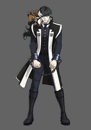
He has the look of a Meiji Restoration-era fighter
A big “Thank you!” to Mr. Fuse for going into so much detail!
And that’s all for this time! But if you’ve ever wondered how the translators and I come up with the English names or how we localize a character as steeped in Japanese culture as Simon Blackquill, keep an eye on Unity, as in my next post I’ll be sharing some localization tidbits.
Until then!
-
Brands:Tags:
-

Loading...
Platforms:
