Visual Design, Special Effects, and Localization – Oh, My!
Aug 27, 2016 // Janet Hsu
Welcome to the third in our series of development and localization blogs. Last time , we discovered one of Rayfa’s early designs, heard about how the team arrived at the look of the Kingdom of Khura’in, and how the Khura’inese language was Romanized for the English version. This time, we’ll be continuing our tour of all things graphical with a look at the UI and the game’s many visual effects.
But before we do, just a quick reminder that the demo for Spirit of Justice is out RIGHT NOW on the Nintendo eShop! Be sure to check it out if you haven’t already!
Now, for those of you who have played the demo, you saw for yourselves how there are many aspects of the user interface, or “UI,” that are different from what we’re used to, aren’t there? I’ll let Ms. Nakano share with us why that is. Take it away, Ms. Nakano!
———————————————————-
Of Lettering and Fonts
Hello! I’m UI designer Reiko Nakano. As a UI designer, it is my job to create the layout and look of anything that conveys information about the gameplay to you, the player. This includes the title screen you see at the very beginning when you start the game, to the menus, Court Record, and dialogue text windows that you use and see all throughout the game, and even to the game’s credits at the very end.
But it’s not all about how pleasing everything looks – my work requires that I work closely with the game designers and the director to figure out how the different screens will transition into one another, and what kind of layout (like where should what kind of button go for ease of playability, etc.) would be best suited to the gameplay experience we want to achieve.
UI design is directly connected to how a game plays and how easy it is to navigate, so it’s a suuuuper important aspect of any game, but I fear this entry will get quite boring if I go into too much detail about it So instead, let’s talk about what I hope will be a bit more fun of a topic: this game’s font design.
Compared to Dual Destinies, Spirit of Justice uses a ton more fonts. There are two main reasons for this.
The first is because there are two courtrooms, one in each country.
Director Yamazaki and Art Director Fuse: “We reeeally want each court to have its own Guilty and Not Guilty designs.”
Nakano: (*゚▽゚) “Okay!!!”
Yamazaki and Fuse: “Ooh, and let’s have different designs for the Witness Testimony and Cross-Examination bits, too.”
Nakano: ( ゚∀゚) “Okay!”
Yamazaki and Fuse: “And wouldn’t it be great to have different opening sequences for each country’s trials, too?”
Nakano: ( ゚v゚) “Okay.”
Yamazaki and Fuse: “And of course, we have to have different life bars!”
Nakano: ( ゚-゚) “O-Okay…”
That may or may not have been exactly how it really went, but the important thing is that we ended up needing two different UI designs for the trial sections.
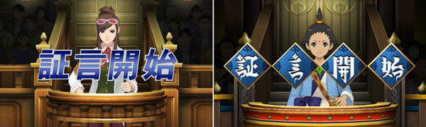
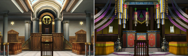
Well, what do you think of the two different Witness Testimony designs? There’s the usual no-frills version on the left and the mysterious and exotic Asian version on the right. They both suit the atmosphere of each country’s courtroom pretty well, don’t you think?
By the way, the font that’s used for the Khura’in trial section is an original font created by our team’s UI designers.
So you see, even the fonts we use are a window into the world of Ace Attorney.
******************************
The second reason why we had to use a lot more fonts this time around is because of the new Divination Séance gameplay system.
I know there are probably a lot of you who have played the demo for yourselves, but this new, mildly spine-tingling gameplay system shows the sensations a person experienced during the final moments of their life through video and text.
“Huh?! Show different sensations through text…? You mean like “hot,” “loud,” “delicious” – those kinds of sensations – through text…?” I asked.
Game Designer Mr. Daigo: “You got it!!”
…What a tall order that turned out to be.
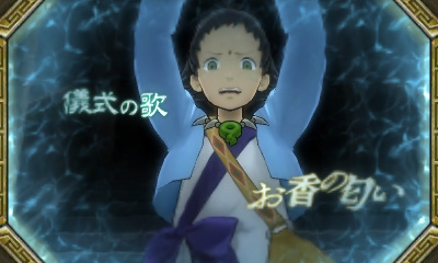
The gameplay system presents what the victim experienced with all five senses as a video to the player, who then uses it to unravel the mystery. This meant that other than sight, all of the other senses would have to somehow be represented through text. This necessitated that the kanji characters themselves convey and conjure up the specific feelings and nuances associated with each sensation.
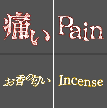
Let’s take a look at this picture for a concrete example of what I mean.
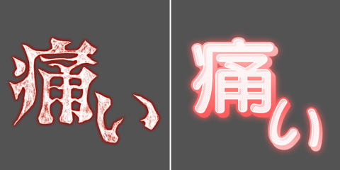
The characters on the left for “pain” (ç—›ã„) are what are actually used in the game. Because this word is supposed to represent the sharp pain the victim felt just before they died, it had to look super painful as well in order to convey that sensation to the player.
The characters on the right are… how should I describe them…? It looks like the sort of lettering that would be used to represent the victim bumping into a new transfer student who’s munching on a piece of breakfast toast as they round a street corner. The font has a sort of pop, sweet-and-sour feel to it.
I picked two very different fonts so it would be easier to see the difference, but you can see how even though they both say “pain,” the font on the left conveys the true severity of the pain much better than the font on the right.
And that’s how it came to be that we used a bunch of different fonts to convey a variety of feelings and sensations through the kanji characters in the Divination Séances. In creating these characters and deciding which font to use to convey what, I relied on my personal judgment and biases… No, actually, I made myself feel what each victim must’ve felt.
For those of you who are really into fonts, it might be fun to try to guess them all after you’ve finished playing the game.
Speaking of being really into fonts, during the latter half of the game’s development, there was this one person who had an objection to one of the fonts I’d picked for the Divination Séance.
Fukuda: “Um… The font for this sensation… It’s not exactly what I had in mind, so do you think you can fix that for me?”
It was the uncompromising Mr. Fukuda of the writing team! I guess I should’ve expected as much from the one who came up with that scene in the first place.
And so you see, there’s a lot of careful thought and consideration (and blood and tears…) that’s hiding there right in front of you – it’s even in the letters and characters we normally take for granted. Nothing would make me happier than if you could feel the work we put into this game coming from each pixel of the screen!
———————————————————-
Thank you, Ms. Nakano! There were definitely a lot of different fonts this time around, and I’ll get into how we localized all of those sensations in the Divination Séance in a little bit (It was no small task, let me tell you!). For now, I want to share with you how we created a second set of UI for the Khura’inese court in the localized version with two examples.
First, let’s take a look at the Witness Testimony intro.
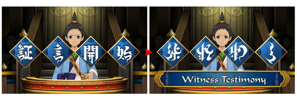
Before we arrived at the final English version on the right, Ms. Nakano put together a few different rough ideas like these.
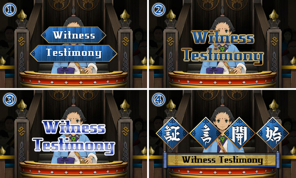
Among the options we considered were a variation on the wooden panels look (1), a more traditional AA look colored in the Khura’inese court version’s style (2), a completely traditional AA look, including the usual blue and white colors (3), and a subtitled look (4).
Eventually, we chose to use option 4 as a starting point for a variety of reasons, including the fact that it allows the player to see the witness’s face. We completed the design by turning the Japanese into Khura’inese letters (these are localized version exclusives!), picking a more suitable font for “Witness Testimony” to go with the Khura’inese letters, and making the scroll into more of a tasseled banner so it would fit in with the ribbons and tasseled decorations motif of the Khura’inese courtroom better.
As for what happens when you get a game over…
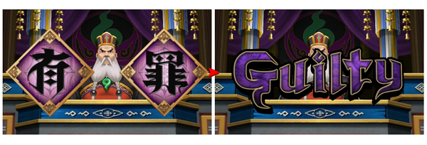
This time, we also started out with a few options, including these below.
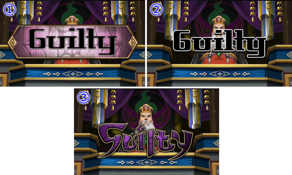
As you can see, because of the letter “y”, the one giant panel version (1) wasn’t exactly very pretty, and standard font #107 with normal AA style coloring (2) was kind of plain, too, but Khura’inese-flavored custom font (3) hit all the right notes. As we were iterating on the font, we also realized that in order to lend the word “Guilty” any weight visually, it would have to be bigger and the letters would have to be thicker, so sadly, the final design ended up covering the poor judge’s face. But the tweaks we made definitely makes the word look more foreboding than in the original concept design, doesn’t it?
Now, as I promised, I will get into how we localized the UI text for the Divination Séances, but before that, there’s something else you should know – how the visual effects for the Pool of Souls were created. Luckily, I have just the person to tell us about that! Ms. Akizuki, the floor is all yours!
———————————————————-
On Creating Visual Effects
Hi, I’m Chieko Akizuki, and I’m the lead effects artist for Spirit of Justice. Nice to meet you.
What’s the first thing you think of when you hear “visual effects” in the context of games? Do you think of magic and explosions? Roaring flames, columns of water, or even lightning bolts?
Well, my work on Spirit of Justice consisted of… gathering fruits and vegetables from the mountains near my house and giving them to those younger team members who were living all alone – or to those who just didn’t get enough vegetables in their diet – and keeping the snacks table stocked each and every week with a mountain of delights. The most popular snacks on the team are sweet manju [red bean cakes/buns] and savory senbei [Japanese rice crackers]!
Just kidding.
(But not really.)
…Anyway!
The basic gist of my job is to design the look of something in motion, regardless if the visual effect representing that movement is actually visible or invisible to the naked eye.
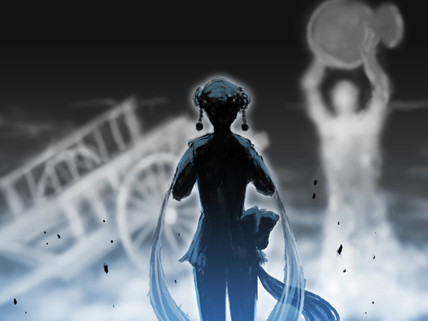
Have you tried the demo yet? If you have, then you’ve seen that one of the features of this game is the Kingdom of Khura’in – a country where even the average person’s daily life is closely tied to the art of spirit channeling. Trials in Khura’in are conducted via a special rite called the Divination Séance, whereby the royal priestess performs the Dance of Devotion and channels the last memories of the dead into the Pool of Souls. As an example of what I do, I’d like to talk a little more in depth today about the visual effects for this Divination Séance.
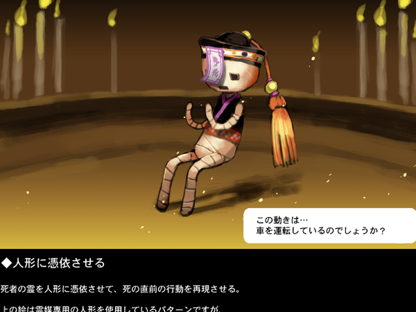
There were a bunch of different ideas floating around before we settled on the idea of having the victim’s memories appear in a pool of water. Having the victim’s spirit possess a puppet, and even using the smoke from giant incense burners to reenacting the crimes through shadow plays were just two of the ideas we had, but the rest of them were all equally as supernaturally eerie and unsettling.
However, more than anything else, the Divination Séance had to be a solid gameplay system. So, naturally, anything that wasn’t fun to play and interact with didn’t make the cut. Once we had settled on using a pool of water, that’s when the real work started for me.
The task before me was to design the visual effects for a mystical pool with a touch of the occult in the form of spirit channeling that would fit into the world of Ace Attorney. I had to consider that, as an interactive gameplay element, the Séance vision was going to be shown as appearing in a pool of water that also acts as a mirror. At the same time, words representing the other four sensations were going to come and go in the water as the story dictated, so there was a need to make sure they would be reasonably legible. I looked at so many pictures and watched so many videos of the sea, swimming pools, ponds, and lakes, and tried to apply the Ace Attorney style to my designs. After many, many failed attempts, this is what I finally came up with.
Were you able to catch a glimpse of the pool in the video? (It’s at around the 0:42 mark.)
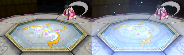
Here’s a special look at the Pool of Souls from another angle. Ordinarily, the pool looks all calm like the picture on the left, but when it’s been charged up with spiritual power (and visual effects), it looks like the picture on the right!
So, what do you think? This is how I make the invisible, yet wondrous and mysterious powers that exist in the world the director and the art director envisioned, visible. In fact…
… there are a ton of other scenes where my visual effects were used to add a punch to what’s going on in the scene. And I’m not sure if it’s because this is Ace Attorney, but… I bet you’ll be surprised to know that while there are some scenes I made look good through visual effects, there are others that you’d expect to have been, but weren’t. But I’m afraid I’ll have to tell you more about them some other time…
And that about does it for the visual effects of Spirit of Justice. It would make me really happy if you took note of them as you played. On that note, I hope you’ll enjoy the rest of these blogs.
———————————————————-
Thank you, Ms. Akizuki! The world of Ace Attorney would certainly be a lot less magical without your special effects! Having seen some of those other scenes without the visual effects layered on top, it really goes to show how important these extra touches are to completing the atmosphere of any given scene.
As for the Divination Séance, localizing it involved a lot of teamwork between me and Ms. Kobayashi, the lead UI designer for the localized version, but Ms. Nakano and Ms. Akizuki’s work on the Japanese version were surprisingly big factors in how we adapted the fonts, and even the translations themselves!
As Ms. Nakano explained, the first step was to make sure that the look of the fonts used to express each sensation matched with the feeling they were supposed to invoke. But in the case of English, this meant that Ms. Kobayashi had to not only choose a good font, but also figure out the layout of the letters. Take the words “pain” and “incense” as an example.
The individual letters of the word “pain” could’ve been lined up in an infinite number of ways, but this arrangement where each letter is off-center and doing its own thing is perfectly suited to the disorienting feeling of intense pain. Compare that with the word “incense” where the uniform spacing between the letters and the overall curved shape of the word forms an image of the scent of sandalwood wafting to the victim’s nose on a breeze.
Another thing you may notice is that the length of the words is rather short, and even whole words have been dropped, like “the smell of incense” (ãŠé¦’ã®åŒ‚ã„) becoming just “incense.” This is for two reasons.
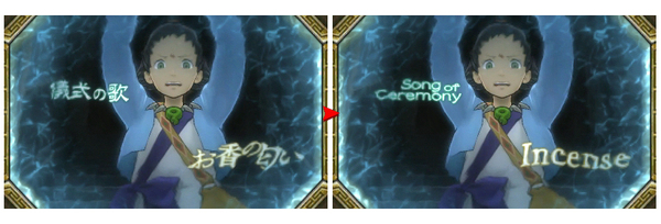
1) The English had to fit within the same space as the Japanese graphic. This is so that crucial parts of the video would not accidentally be covered up, rendering the puzzle unsolvable.
2) The pool’s rippling effect gets stronger the further out towards the edge you go, so the words become increasingly blurrier and harder to read. Try to cram in too many letters and each letter has to be smaller, rendering all of them an illegible mess if we were not careful.
So thanks to Ms. Akizuki’s nifty water effect, Ms. Kobayashi and I had to tweak and re-tweak these words a number of times to make sure they were all reasonably legible on a Nintendo 3DS screen. But thanks to Ms. Nakano color-coding each type of sensation and also making that info appear when you cursor over a word, at least I could cut redundant words like “smell” from the translation. In the end, I hope you’ll agree that we managed to adapt the Divination Séance’s lettering to the English language well.
All right, that’s enough out of me for one week. Join me next Friday for some more tales from the trenches, courtesy of game designer Mr. Daigo, and even some Spirit of Justice character design and English version world building trivia!
Until then!
Catch up on previous blog entries here!
-
Brands:Tags:
-

Loading...
Platforms:
